

Software impacts human lives – let us put more thought into it!
Here is what happened and my take on how software design may have been partly responsible and could be improved >>
Miami Shocked!
Miami state in the US received a massive panic attack on Saturday the 13th of January 2018. More than a million people in Hawaii were led to fear that they were about to be struck by a nuclear missile due to circulation of a message sent out by the state emergency management. The message sent state wide just after 8 a.m. Saturday read: “BALLISTIC MISSILE THREAT INBOUND TO HAWAII. SEEK IMMEDIATE SHELTER. THIS IS NOT A DRILL.”

The residents were left in a state of panic. People started scrambling to get to safe places, gathering supplies and even saying their goodbyes. Some took shelter in manholes, some gathered their kids into the most sheltered rooms in their homes like bathrooms or basements, some huddled in their closets and some sent out goodbye messages to their loved ones.
Turned out it was a false alert. Around 40 minutes later, the agency sent out another message saying that it was a false alarm sent out by mistake!
The questions being asked was – how could this happen and why did it take 40 minutes to check and issue an all clear?
Why Did This Happen?
Investigations into the incident were revealed and the governor stated that “It was a procedure that occurs at the change of shift which they go through to make sure that the system is working, and an employee pushed the wrong button.”
The error occurred when, in the midst of a drill during a shift change at the agency, an employee made the wrong selection from a “drop-down” computer menu, choosing to activate a missile launch warning instead of the option for generating an internal test alert. The employee, believing the correct selection had been made, then went ahead and clicked “yes” when the system’s computer prompt asked whether to proceed.
Analysing the Root Cause
But is the fault only at human level? The software being used for such critical usage also needs to help out to avoid the possibility of such human errors.
After all triggering such a massive state-wide emergency warning should not have been as simple as push of a wrong button by a single person!
Could a better design of the software have prevented this kind of scenario from happening?
As reported, the incorrect selection was made in a dropdown – which lets imagine would look something like this-

After the selection was made, the system sent a prompt and the employee, believing the correct selection had been made, then went ahead and clicked “yes”.
So by this information we can assume that the prompt would have been something generic like

Though it definitely is a human error but isn’t the system also at fault for letting this happen so easily?
Better Design Ideas – More Thought – Improving Your Software
By putting in some extra thought into design of the software we can make it more robust to avoid such incidents.
Here are some things that could have helped design it better –
- Do not have the TEST options placed right next to the ACTUAL emergency options!
Have different fields or perhaps different sub menus inside the dropdown as categories.

>> Always have the TEST category of warnings higher up in the list
>>Have the Default Selection in the dropdown either as BLANK or as one of the TEST warnings and not the actual ones
>>Having the actual warnings section lower down and separated away from the similarly worded TEST warning would ensure lower chance of wrongful selection of the similar named option from the dropdown
- The prompt message must be made unique to each scenario and in case of selecting a real warning issue action, the prompt must ask the user to specify the emergency.
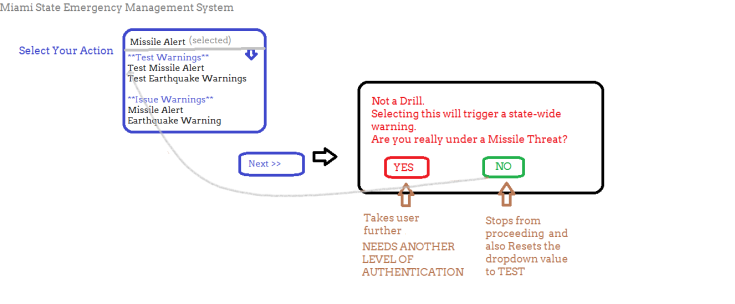
>>Make the prompt appear critical with use of color and text
>>A critical prompt must catch the user’s attention and not be similar to the other screens and popups of the system, to avoid the possibility of clicking on it in a hurry.
>>Placement of Yes and No buttons on unusual sides (Yes is on the left which is not typical) avoids the click of the button – also used Red and Green to signify the importance situation. Red is the usual code for danger.
- Additional level of authorisation must be added to the scenarios of real emergency warnings being issued. So, for the TEST actions, user may proceed and begin the drill but in case they select ACTUAL warning then the steps take it to another level of authorisation where another employee – a peer or a senior- reviews the action and performs the final warning issue.
>>This prevents erroneous actions and also some possibility of hackers or notorious people issuing false warnings just by gaining access via one user.
>>Define your hierarchy of users or approvals for each case of emergency.
These ideas may sound basic but all these are components of good Usability of the software, its appropriateness of purpose and setting up basic security in usage of the application.
We are just playing around human psychology, easier understand-ability and attention spans.
Let us endeavour to give a little more ‘thought’ to the system
- Think about its real world usage,
- Implications of a wrong action in the system,
- Add more practicality into the design,
- Make space for human mistakes,
- Help humans make better & informed decisions, and
- Explore all possibilities to avoid such errors.
Cheers,
Nishi

But Miami is on the other side of the continent 🙂
LikeLike
[…] Hawaii False Missile Alarm – was it entirely a Human Error? – Nishi Grover Garg – https://testwithnishi.com/2018/01/15/hawaii-false-missile-alarm-was-it-entirely-a-human-error/ […]
LikeLike
Thanks @testingcurator for featuring this article in the good reads list! http://blog.testingcurator.com/2018/01/21/testing-bits-jan-14th-jan-20th-2018/
LikeLike
This article is now featured by the Euro Star Testing Blogs roundup
https://huddle.eurostarsoftwaretesting.com/blogspy-231-qa-testing-blog-round-up/
Thanks!
LikeLike
[…] alarm and ended up raising panic amongst almost a million people of the state all for nothing, (read here for detailed report) I would like to bring back the focus on implications of poor software design leading to such human […]
LikeLike